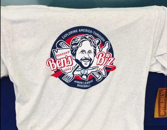
Results tagged ‘ Logos ’
Market Saturation and Wireless Communication
Among this year’s crop of new Minor League logos, surely the most striking was the Lexington Legends’ away cap. It features a mustache, and nothing else. Or, if you prefer images to words, it features this:
By adopting such a look, the Legends were clearly aiming to make an impact outside of their market. Ty Cobb, the team’s graphic designer, acknowledged as much when I spoke with him at the time of the logo’s unveiling.
“Minor League Baseball is all about the ‘wow’ factor, and we wanted to go beyond the normal stuff you’d see at the ballpark,” said Cobb, whose name is totally unremarkable. “And we wanted to be the team to do this first, to have a mustache on a hat. Our mascot, he actually has a mustache, so we’re not just hopping on a fad. … We’re going to be easily recognizable when on the road. Fans can just look at the mustache.”
As the Legends hoped, many fans have done more than just look at the mustache. They’ve gone out and bought it. As of today, the team has sold the hat in 45 out of 50 states en route to their goal of “mustache domination.” Or, if you prefer images to words:
For the most part, this is a simple matter of demographics as Alaska, Montana, Maine and Vermont are among the ten least-populated states. But Arkansas? What’s up with that? Nearly three million people live there — including those who are fans of fellow Royals affiliates the Northwest Arkansas Naturals — and yet none have sprung for a hat.
(Perhaps because headwear would only sully their beauty? As I learned last season, Arkansans are nothing if not beautiful. Just scroll through this blog post for proof!)
All of this begs the question — has any team ever sold a particular piece of headwear in all 50 states? Or will the Legends be the first?
Once again it is I, cold and alone, who asks the questions that no one else dares to.
—
Moving on to other matters, let this be your thrice-monthly reminder that my Promo Preview column runs every Tuesday on MiLB.com. Click HERE to read the latest edition, which is virtually hot off of the virtual presses.
Included within this week’s column is a write-up on Thursday’s “Manager Cell Phone Night” in Omaha, which pays tribute to emerging dugout-to-bullpen communication technologies. Since the column went to (virtual) press, promotions manager Ben Hemmen (the second-best Ben H. working in Minor League Baseball, after yours truly New York-Penn League president Ben Hayes), sent the following supplemental information. I, for one, love it:
– In honor of all Major League Baseball “Calls to the Bullpen” happening on cell phones this season, the Omaha Storm Chasers are offering anyone who brings in a rotary phone or old cell phone for donation a “buy one box seat, get one box seat for FREE” ticket special.
– All “Calls to the Bullpen” will come with a special surprise from Jirsch [Manager Mike Jirschele]. We will also unveil never before heard or seen manager to manager phone calls, voicemails and texts on the videoboard.
And since you can do everything on a cell phone these days, other exciting offers, deals, competitions, and games will take place at Thursday’s game:
– There will be a Facebook challenge that night for a FREE night at a future game in the Safeco Insurance/ Manager Mike Jirschele Dugout suite.
– If you e-mail the Team Store at the game that night (stormfront@omahastormchasers.com), you will receive a coupon for a special offer.
– A few lucky fans who use twitter on Thirsty Thursday and hashtag #BudLight or #Pepsi to @omastormchasers at the right time will have enjoy a beverage on the house.
– The person who posts the best picture of Manager Mike Jirschele to Instagram will win an autographed Mike Jirschele cell phone.
I was going to end this post with a picture of Mr. Jirschele, but in my quest to find a photo of him I inadvertently stumbled upon this shot of Alice Cooper and Mike Moustakas. Love it to death:
benjamin.hill@mlb.com
twitter.com/bensbiz
New Looks for the New Year
The Year in Blogging 2013 now commences, with post #899 in Ben’s Biz history. This post shall begin, as they all do, with a far shorter introduction than the over-the-top soul searching that was initially written and then mercifully deleted.
Let’s begin by looking at some new logos that may or may not have slipped through the cracks of your radar (btw, one of my New Year’s resolutions is to employ more mixed metaphors). New logos such as that which will be sported by the St. Lucie Mets in 2013 and beyond:
The above picture is taken from the team’s Facebook page, as a supposed “new uniforms” article on the team’s website simply links to a blank promotion schedule. Fortunately the local TC Palm is there to fill in the information void, as their article included the following quotes from Mets director of Florida operations Paul Taglieiri.
“We wanted to stay with what the big club was doing and also add our own touches to it,” he told the paper. “I love the orange. We moved the black away from the uniform, and it really has a Florida look to it. And I love Florida Mr. Met — it gives us our own identity as our own team.”
Taglieiri also noted that the Mets considered a total identity overhaul, but decided that a continued alignment with the parent club would be a more prudent course of action.
“We thought about getting away from the Mets and every time we considered something new like the St. Lucie Squid or the Salamanders or the Sand Sharks, we just coming back to the Mets,” Taglieri said. “That’s what Port St. Lucie is. We felt it would have done us an injustice. It made sense to stay with the Mets and change up the look a little bit.
So there you have it.
—
Another team that changed up their look a little bit was the Peoria Chiefs, a move precipitated by their affiliation switch from Chicago to St. Louis.
The team has issued a press release detailing the triumvirate of new hats and jerseys that shall be sported in 2013. Read it HERE, and check out corresponding PDFs that show both the hats and the jerseys.
—
And, finally, how about a good old-fashioned anniversary logo? The Frederick Keys would like you to know that they are now old enough to rent a car:
—
I’ll end this post with one of many videos I somehow didn’t get around to posting during the season. This one, in which a locomotive confirms its Montgomery baseball allegiances, is a 23-second classic that I will have to link to since I am having some embed problems at the moment.
Watch it HERE. I command you.
twitter.com/bensbiz
benjamin.hill@mlb.com
Instant Interview: Dan Simon (of Studio Simon) on Winter Meetings Logos
Prior to the Winter Meetings, I made it be known that I would be willing to conduct an “instant interview” with any attendee interested in doing one. A whopping two people ended up taking me up on it, the first of whom shall be featured today: Dan Simon.
While you may not recognize his name, Simon’s work is familiar to anyone with even a passing interest in Minor League Baseball. He’s the man behind Studio Simon, the Louisville-based design firm responsible for dozens of logos throughout the MiLB landscape (including recent efforts such as the Erie SeaWolves and Aberdeen IronBirds.) He’s also the man behind this, the official logo of the Winter Meetings themselves:
In this brief Q and A, Dan sheds a little light on the history of the Winter Meetings logo and the philosophies and strategies that guide the process.
Ben’s Biz (aka: “The Guy Typing This”): How long have you been designing the Winter Meetings logo?
Dan Simon: The first one was 2003, New Orleans. The reason for it was because Brian Earle, who at the time was director of licensing for Minor League Baseball, saw that [offseason] events like the NFL Draft and, later, the Combine, were now branded. Similarly, Brian wanted to brand the Winter Meetings as what they are: one of the biggest, if not the biggest, offseason events in all of sports.
And it wasn’t just about what the Winter Meetings were, but what they should be. We certainly can’t take all of the credit for it, but the growth of the Meetings to where they are today started to happen when they were branded as an important event. That was Brian’s vision, and that was the result.
Ben’s Biz: So what are the key elements of a good Winter Meetings logo?
Dan Simon: I had already done two Super Bowl logos – XXXVI in New Orleans and XXXVII in San Diego. Both of those events were branded to be city-specific and we wanted to brand the Winter Meetings similarly. People are coming from all over the United States, to this one place, and we wanted the identity to reflect the destination. The first one we did, in New Orleans, had a jazz musician in it. 2004, in Anaheim, represented southern California’s car culture and Dallas 2005 had steer horns and barbed wire.
In the future, maybe we won’t be site specific. We’ve already done two in Orlando [site of the 2013 Meetings], so maybe we’ve already covered the appropriate visual references…Now we may be looking to do a logo that is more about baseball and the Winter Meetings than it is the destination. I don’t know if we’ll necessarily go that way, but it’s something that we’ve discussed.
Ben’s Biz: What was the thought process behind this year’s logo?
Dan Simon: Nashville is the Music City, of course, and 2007′s logo had a music theme as well….There are other things about Nashville, but that’s what people really know about it and so we wanted to re-visit that theme.
There’s also the Trade Show and Job Fair. Those are secondary logos, the children of the Winter Meetings logo, which is the main logo. They’re not meant to look exactly alike, but the Trade Show and Job Fair should look like they were born out of the primary Winter Meetings logo. We used a record-containing shape for the Trade Show and a guitar pick for the Job Fair, so it’s all music related. But it all starts with the jukebox.
The primary logo and its two “children”:
—
Thanks, Dan, for taking the time to speak with me. If you’d like to share something related to your experiences within the world of Minor League Baseball, then please don’t hesitate to get in touch. (Seriously — if you hesitate I will be offended.)
benjamin.hill@mlb.com
twitter.com/bensbiz
Asparagus: The Details
As this will be the last post of November, I may as well lead it off with the topic that always dominates this soon-to-be-expired stretch of the calendar: new logos. It was helpfully pointed out to me earlier this week that I had neglected this recent entry to the alternate logo canon. And what an entry it is:
This one’s courtesy of the Stockton Ports, who will sport this character on their cap during each and every Friday home game next season. The team explains thusly:
The Ports new logos honor Stockton’s heritage as the largest in-land port in California and the Asparagus Capital of the World. A new character, 5 O’clock Dock, is the centerpiece of the identity, brandishing his baseball tattoos and asparagus club.
My favorite line in the press release, however, is the one that notes that the Ports have become “the first professional sports team to use Asparagus green.” Congrats on that accomplishment, guys, but considering the team name and asparagus theme I am disappointed by the failure to incorporate an aromatic “P.”
—
In other California League headwear news, the Lake Elsinore Storm announced last month that they are now selling 20th anniversary throwback hats that commemorate the team’s original look.
The Storm’s current “eye” logo has long been one of the most popular marks in Minor League Baseball, and that logo can be traced back to designs such as the above. (The eyes used to be part of a larger “Storm” motif, see?) Perhaps that’s a lesson for other clubs — take a particularly striking element of your current logo, then isolate and amplify. Sometimes a minimalist approach can work wonders.
—
I’ve been posting less videos on this blog than I have in the past, partially because Twitter has become a good forum for that and partially because watching too many of them makes me feel as if my life is slipping away in slow motion right before my eyes.
But, that said, I wanted to single out this recent Fresno Grizzlies production because it is one of the best videos I have seen in quite some time. For one, it highlights a simple and memorable trick that should be part of every mascot playbook. For two, the production is great. (That is certainly not a given when it comes to team-released offseason videos.)
watch?v=vciUTJruLdk&list=UUwivBU_T238VXsk2Kn0dqDA&feature=plcp
Was the fan who got his hat stolen planted there by the team? Almost certainly. Does it matter? Not at all.
—
And since I’m posting videos, how ’bout this? In Pensacola, the Blue Wahoos have transformed their ballpark into a so-called “Winter Wonderland.” That’s not easy to do in the Florida panhandle!
Skating rink, toboggan slide, jumbo board games, Santa Claus, and more:
watch?v=lnk5UkapEBo&list=UUhxFRSBTWX4fjt5addCXz4A&index=2&feature=plcp
—
Finally, I’ll close with the following: the basketball trick shot dudes of Dude Perfect visited Frisco’s Dr Pepper Ballpark because of course they did. All of human history has led us to this moment.
And that’s all I’ve got for today. I’ll see you in Nashville next week, should you be in Nashville next week.
benjamin.hill@mlb.com
twitter.com/bensbiz
New Logo Alert: The Emeralds Increase Their Northwest Footprint
In 2010, prior to moving into their new home of PK Park, the Eugene Emeralds updated their nature-themed logo so that it looked like this:
But minor tweaks to an inherently conservative look were clearly not enough for the Emeralds, who, under the leadership of GM Allan Benavides, have become one of the Pacific Northwest’s more irreverent and forward-thinking operations (Remember when I visited there?) On Tuesday evening the team held a public event at Eugene’s Ninkasi Brewery Company in order to unveil this mythical monstrosity as their new primary logo.
Yep, that’s a rampaging Sasquatch brandishing a tree in a somewhat threatening manner. Of course it is. In an email, Benavides took the time to explain how this all came to be.
Branding a team around a color (Emerald) was a tough hurdle for us at first. A number of different options were considered including themes that involved the forests, trees and various woodland creatures. However, once we started digging more into the name, the answer became pretty clear.
We’re the Emeralds because of the lush emerald green environment that is Eugene and what lives in the Northwest forest? Ultimately, we felt Sasquatch was the best fit to represent the mystique of the Northwest.
The logo, designed by the seemingly ubiquitous duo that is Brandiose, is unique: the Ems became the first team to use a Sasquatch as their primary logo, as well as the first team to use neon green as their primary color. From the press release:
Sasquatch biting the tree will be the emblem on the home hat while the foot-shaped “E” will serve as an alternate. The road uniforms will feature the “Eugene” script with feet on each end. Home, away and alternate uniforms will be released in the spring.
Biting the tree:
Anyone who wears this alternate cap is going to end up footing the bill:
And then there’s this little number, in which the Sasquatch channels his inner Mary Poppins:
Eugene is a weird place, as I learned when I visited this summer, and now the team has a suitably weird logo. In the press release, Jason Klein of Brandiose acknowledged the city’s effect on the design process:
“Eugene is a hotbed of countercultural ideas,” said Klein. “From Sasquatch sightings to hippy culture, the Ems are honoring Eugene’s eccentricities with a few of their own.”
—
It’s currently logo season here in the world of MiLB. For more blog posts on recent re-brandings, kindly check out the following:
Aberdeen/Buffalo/West Michigan
Scranton/Wilkes-Barre/Hudson Valley
benjamin.hill@mlb.com
twitter.com/bensbiz
Metallic Birds, Batting Buffalo and Feline Waves
The Aberdeen IronBirds must have been well-rested after the holiday weekend, because this morning they set (what I believe) is the record for the earliest new logo unveiling in the history of Minor League Baseball. Beginning at 6:15 a.m., noted baseball bros Cal and Bill Ripken (of IronBirds’ ownership group Ripken Baseball) embarked on a whirlwind early morning tour of local television stations in order to debut the team’s new logo for 2013 and beyond:
As any seasoned MiLB logo observer will be able to tell, the above mark is a Studio Simon creation. (The team relayed to me via Twitter that “the main design idea” came courtesy of Bill Ripken.) The bird seen above replaces the more overtly cartoonish anthropomorphic plane that previously served as the team’s primary logo.
The IronBird featured in the primary logo is even more prominently featured on the hat:
In a press release put out by the team, Bill Ripken employed three verbs over a five-word stretch in an attempt to explain the reason for the new logo. That’s no easy feat!
“The IronBirds are evolving to continue to remain on baseball’s leading edge,” said Bill Ripken, co-founder and executive vice president of Ripken Baseball. “This is why we wanted a fresh new look and feel to connect with families, and resonate with fans of all ages.”
—
Another team to have recently jumped aboard the new logo train are the Buffalo Bisons. The team’s previous blue-tinged logo made an overt attempt to highlight their affiliation with the New York Mets, but with the dissolution of that relationship the Bisons have instead chosen to assume an identity distinct of the parent club (which is now the Toronto Blue Jays).
This logo isn’t “new” so much as it is a callback to a look employed by Buffalo during the years 1988-97. Sez the team:
“It was important for us to reestablish our own team identity with our new logo. Our fans have continued to express their fondness of the red, white and blue logo from the late ’80s and early ’90s at the ballpark. We feel this new logo not only pays tribute to that history but gives the team an exciting new look for the future,” said Mike Buczkowski, Vice President/General Manager of the Bisons.
And far be it for me to gratuitously point out press release typos, but this one is really funny:
For the past four seasons, the Bisons adopted a blue and orange theme with a more atomically correct bison charging out of the city landscape.
—
And, finally, there are the West Michigan Whitecaps. The club has unveiled an array of supplemental looks in advance of their upcoming 20th anniversary campaign.
The “Olde English” logo will now serve as the team’s official road cap. And, wow, that alternate logo on the far right is certainly one of the more ridiculous to come down the pike this offseason. It takes the team’s long-standing primary logo and combines it with a tiger because, you know, the Detroit Tigers are the Whitecaps’ parent club. Here’s one more cut-and-paste job for you, before I end my blogging day:
“I’m excited about these new logos,” said Whitecaps president Scott Lane. “They strengthen the Whitecaps’ identity with the Detroit Tigers in a very literal way for our fans, who are also Tigers fans. I think the logos are a little more edgy and youthful and will appeal to the younger generation of fans.”
Thanks, as always, for your Ben’s Biz Blog patronage. I am evolving to continue to remain your #1 Minor League Baseball news source.
benjamin.hill@mlb.com
twitter.com/bensbiz


Recent Comments